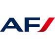
Over the past few years, Air France has been committed to bringing its brand image up to date. Today, Air France unveils an important new stage, its revamped logo.
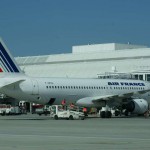
To avoid additional costs, the changes will be made gradually. Aircraft will be painted with the new livery during fleet maintenance operations, and new aircraft will be rolled out with the new logo.
Designed by the Brandimage agency, the logo is now just one word, in an elegant style and with a lighter typography.
« This new graphic identity, underlined François Brousse, Vice President Corporate Communications, aims to express what Air France represents today, i.e. an airline which is proud of its national identity and its values, but which has also become a global brand through the creation of the Air France KLM Group, with more than half of its customers living outside France. »
The national colours remain present on the aircraft’s tail fin and fuselage:
– navy blue, predominant for 75 years, evokes the brand’s historical capital and the airline’s efficiency,
– white, the colour of excellence, suggests well-being and the French travel experience,
– the bright red accent, punctuates and energizes the brand, underlining both French chic and the attention paid to Air France customers by the airline’s staff, both on the ground and on board.
„This new identity, which is both elegant and contemporary, represents the fundamental changes Air France has seen over the past few years. Thanks to the coherence between the old and the new logos, we can ensure a gradual transition for our passengers“, said François Brousse, Air France Vice President, Corporate Communications.
Photo: New logo / Air France


